Overview
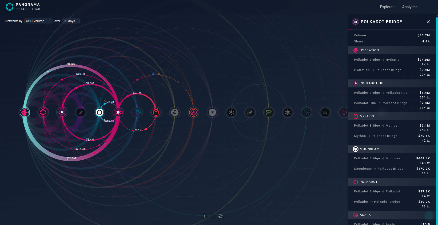
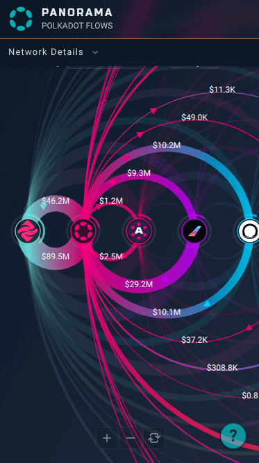
Panorama presents a bidirectional arc diagram visualizing the Polkadot ecosystem networks, with each node representing a network arranged linearly for clarity.
Arcs between nodes show the USD transfer volume over your selected timeframe. Arc thickness and direction reflect transfer magnitude and flow, with full arcs representing bidirectional flows, providing an intuitive view of cross-network value movement and relationships.
You can sort nodes by volume or number of connections to quickly identify major players or hubs. Click any node to explore and highlight its connections.
![]() See it live here: panorama.xcscan.io
See it live here: panorama.xcscan.io
Panorama’s Distinct Advantages
- Fully responsive and clear on mobile devices.
- Displays bidirectional flows clearly in a circuit-style layout.
- Offers an immersive, intuitive understanding of cross-chain transfers.
- Easily reveals strong relationships and network hubs.
- Better handles complex multi-network interactions.
- Facilitates exploration of analytical questions difficult for other visualizations, such as:
- What are the inflows and outflows of each channel?
- Which networks have balanced two-way flows?
- Where do the largest unilateral value movements occur?
- How dense is overall network connectivity?
The Value of a Unique Visualization
Beyond utility, Panorama aim to serve as a signature visual identity for Polkadot. Amid countless dashboards and charts, a distinctive, expressive visualization becomes a unique viewpoint through which users remember and understand the ecosystem.
A novel, clear, and performant visualization is more than a tool: it’s a brand asset that creates a unique, memorable identity that users easily recognize and connect with.
![]() We welcome your feedback to refine the UX and vibes as we prepare for full launch.
We welcome your feedback to refine the UX and vibes as we prepare for full launch.